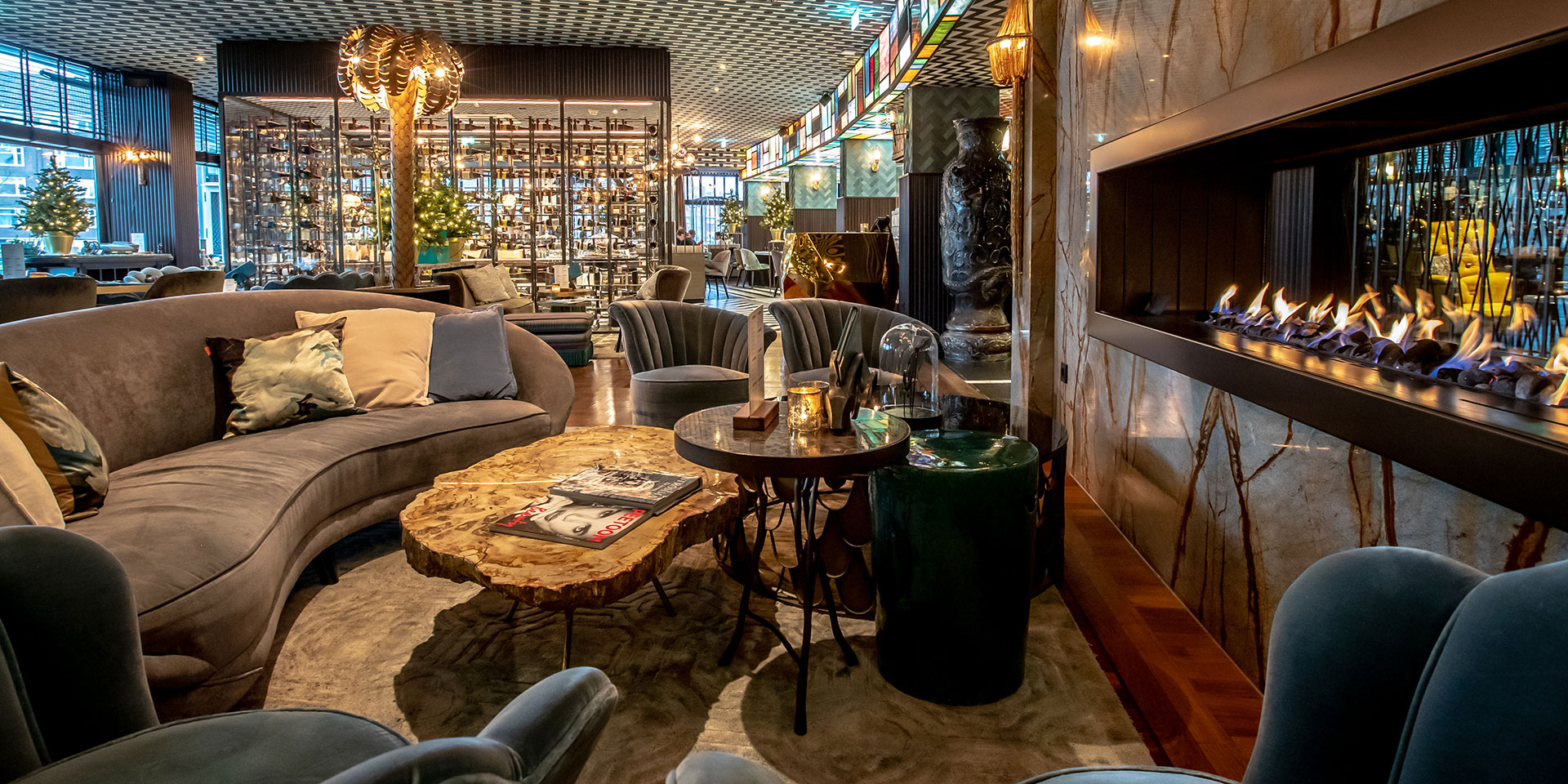
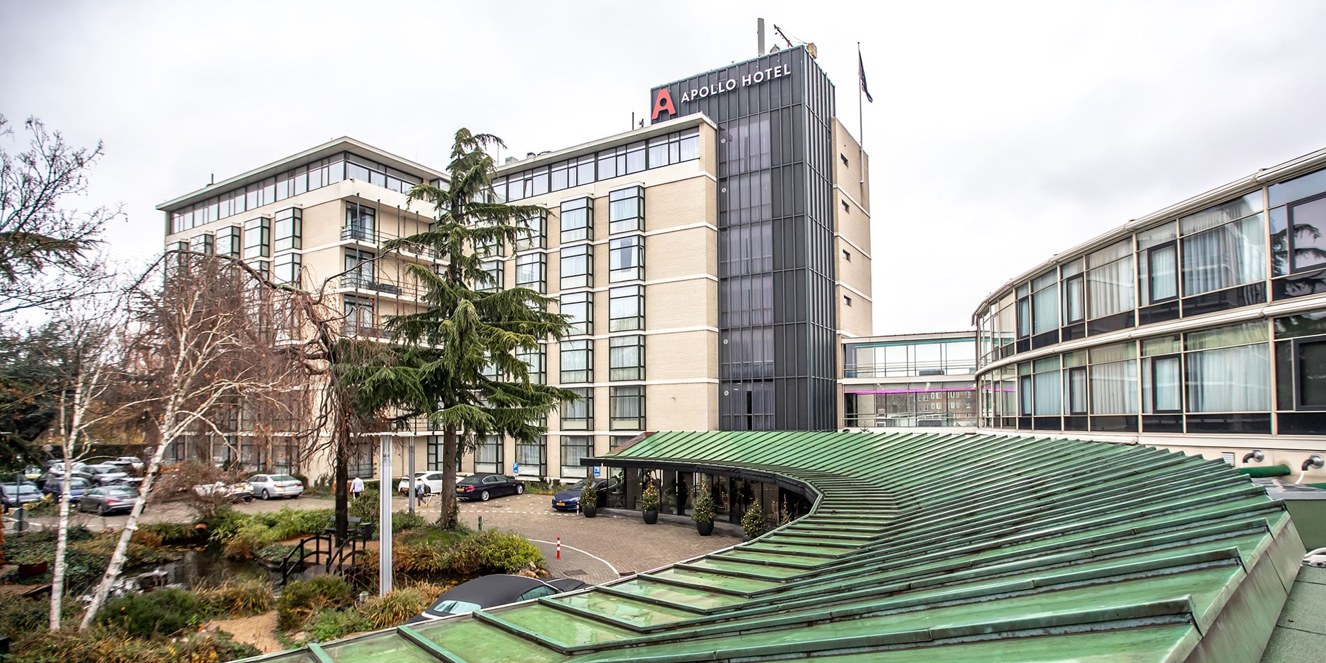
The recently refurbished Apollo Hotel Amsterdam, a Tribute Portfolio Hotel, situated at the heart of five intersecting canals, is a visual delight. Cross the threshold and step into a world where a mix of styles effortlessly converges, complete with quirky patterns, outspoken colors, luxurious materials and vintage items.
Nestled in Amsterdam’s elegant Oud-Zuid district, this glamorously revamped hotel is within walking and cycling distance of the historic city center, famous museums, parks, markets and major business areas.
As always, check for travel guidelines and restrictions before planning your trip.
The oldest part of the hotel dates back to the 1928 Olympic Games in Amsterdam, when the Apollo Pavilion was built as a guest residence. In the decades that followed, the building was expanded and renovated several times, until the interior looked like a typical — albeit uninspired — business hotel from the 1980s.
“It was high time for a change,” says General Manager Imre Heijboer. He is seated on a blue-green velvet chair in The Living Room, the café where guests can have breakfast, hold meetings and relax. The 70s-style bronze palm trees, huge ceramic pots and fireplace recessed into a green-and-brown marble wall are just a few of the many eye-catchers.
“We wanted something more contemporary — but not your standard interior,” he continues. “Something exciting to set us apart from the competition.”
That direction was all Belgian designer Will Erens had to hear. Erens, who works for the design firm Too Many Agencies, had already left his unconventional and exuberant mark on several restaurants in Belgium.
“As someone who regularly sleeps in hotels, I’m not a big fan of white halls and empty rooms,” says a beret-clad Erens, who just arrived at the hotel from his nearby office. “Standard hotels are boring.”
He was therefore excited to apply his signature “less is poor” theme. “I love to inject a bit of color into life,” he says, walking into the Apollo’s restaurant The Living Room, by Bodon, which serves French cuisine. The ceiling features colorful, Mondrian-inspired glasswork.
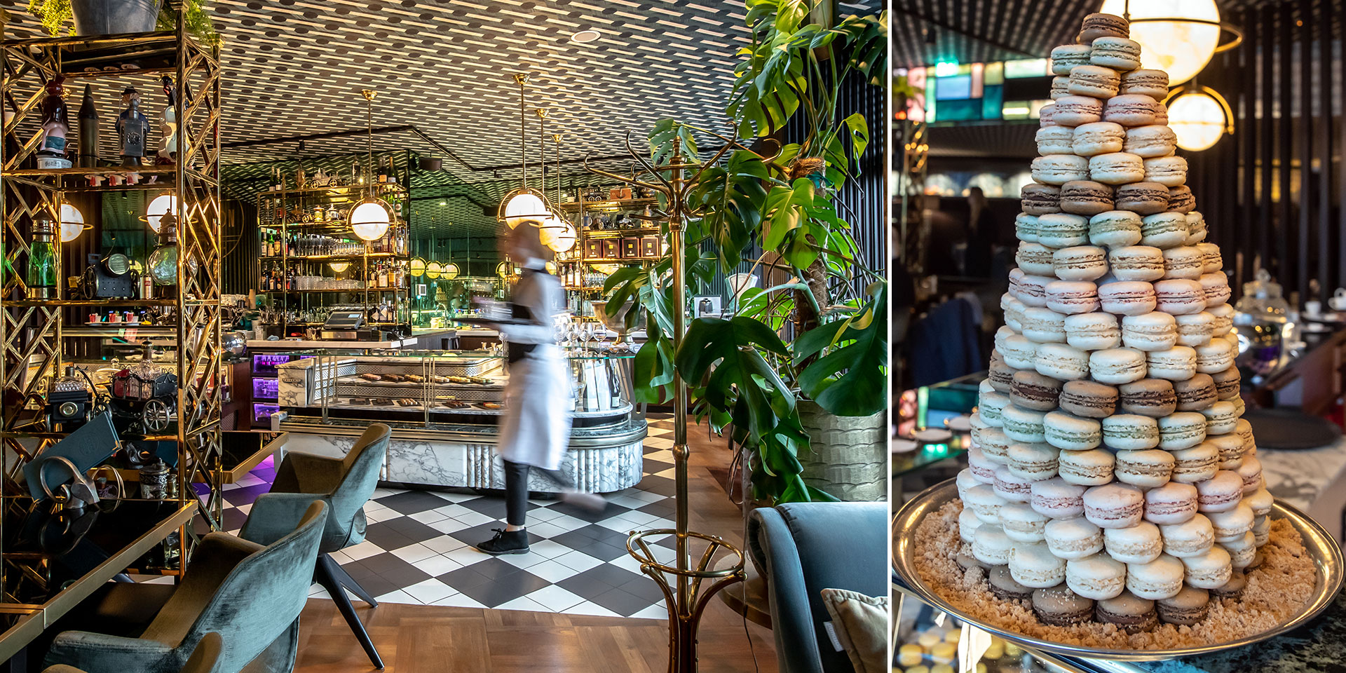
“A little bit of gold doesn’t hurt either,” he smiles, pointing to the gold-colored tiles on the wall. Two guests take a seat on a cage-like bronze art deco bench and enjoy the uninterrupted view of the canals and a small marina.
A Bodon employee places colorful macarons in the display cabinet of an original Parisian patisserie bar from the 1940s. By combining historic elements from different eras, the designer managed to create a truly timeless look. “I want guests to feel like they’re in a time capsule,” he says. “To step back in time and see everything that’s happened here.”
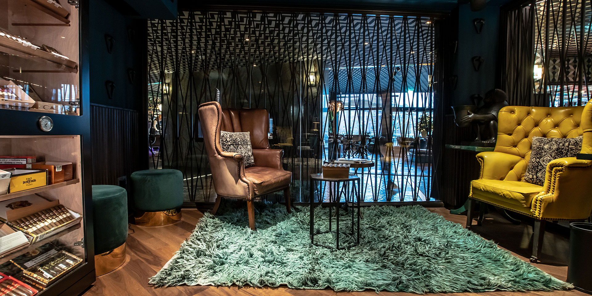
Some elements of the original interior were preserved during the redesign, such as the black marble floor in the lobby, while others were carefully recreated, such as the diamond-shaped iron handrails on some of the staircases, like those in the cigar lounge.
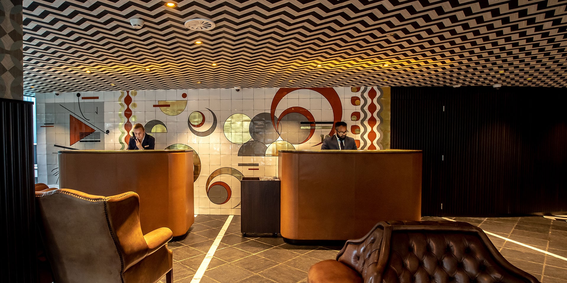
The tile mosaic behind the reception desk was inspired by the original poster of the 1928 Olympic Games in Amsterdam, and the white lines zigzagging across the lobby floor and ceiling represent the Olympic starting lines.
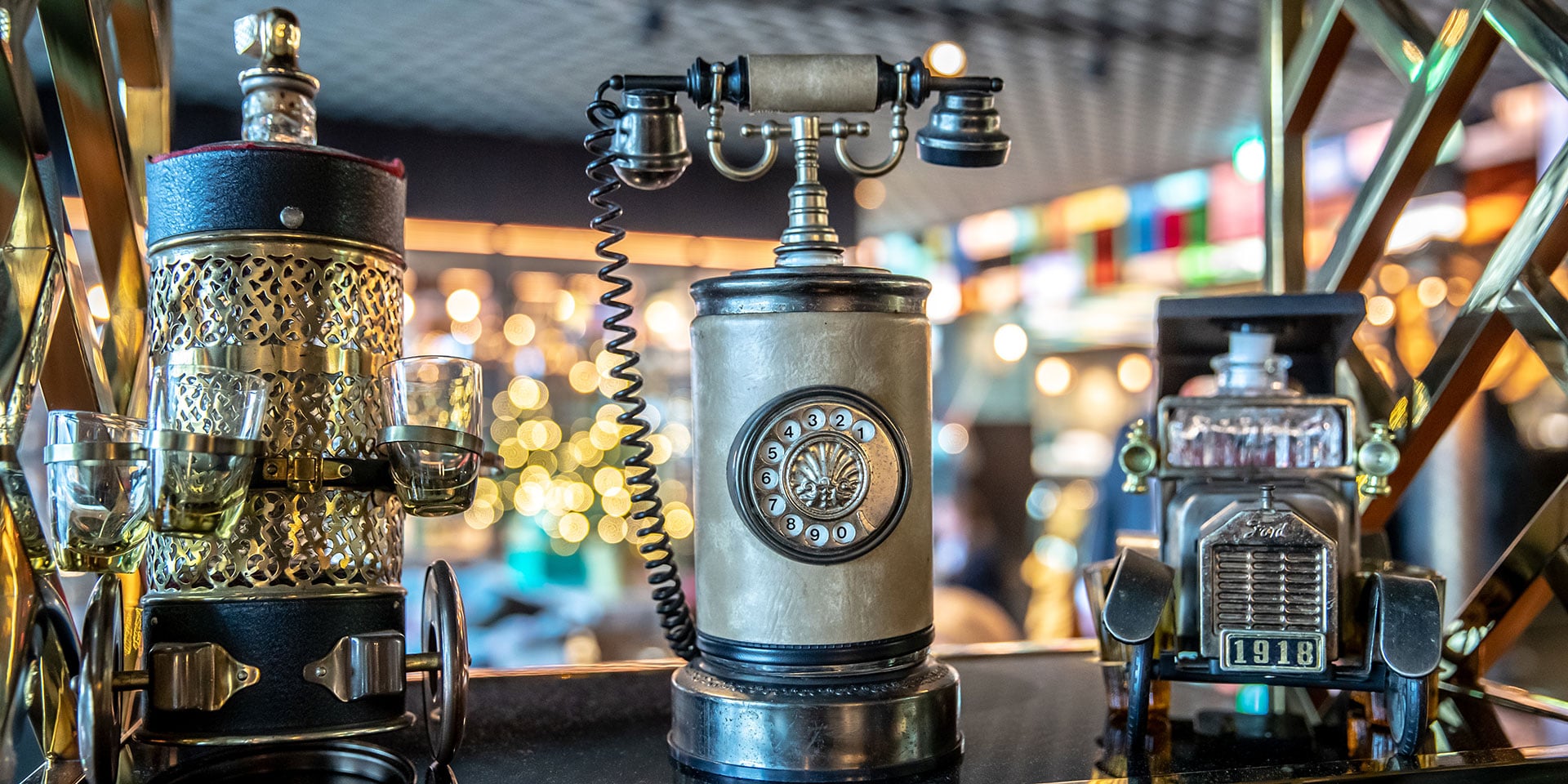
Erens walks to a glass display cabinet and points to some vintage music boxes shaped like cars, phones and other objects, all of which double as secret flasks. “We bought all of these — 60 in total — from an old Belgian man after he passed away.” Erens loved collecting all of the objects, furniture and materials for the hotel.
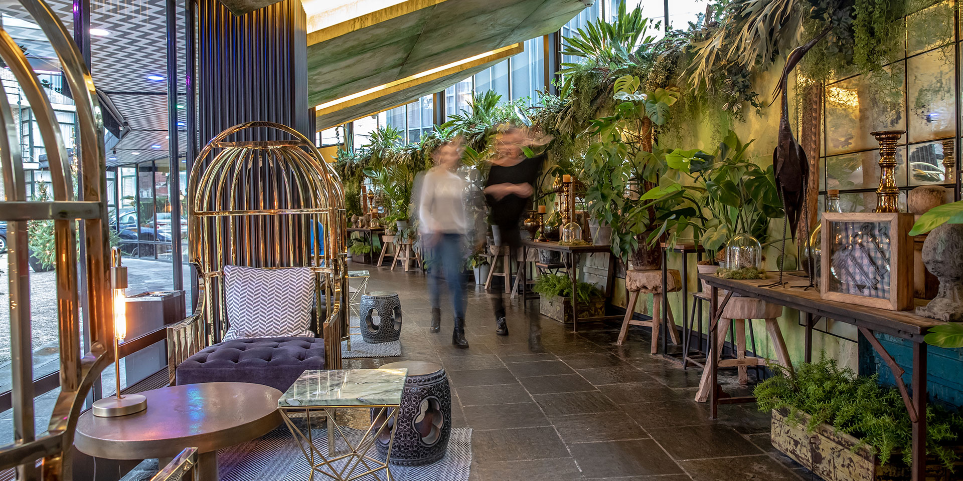
“I discover new details all the time, even a year after the transformation,” says PR & Concept Manager Nikita Marsman, who walks alongside Erens down a hallway filled with large plants, comfortable chairs, old-looking mirrors, cozy carpets, small statues and paintings. “Guests take pictures all the time,” Marsman said, adding that the hotel receives daily requests from fashion brands, magazines and shops interested in holding photo shoots here.
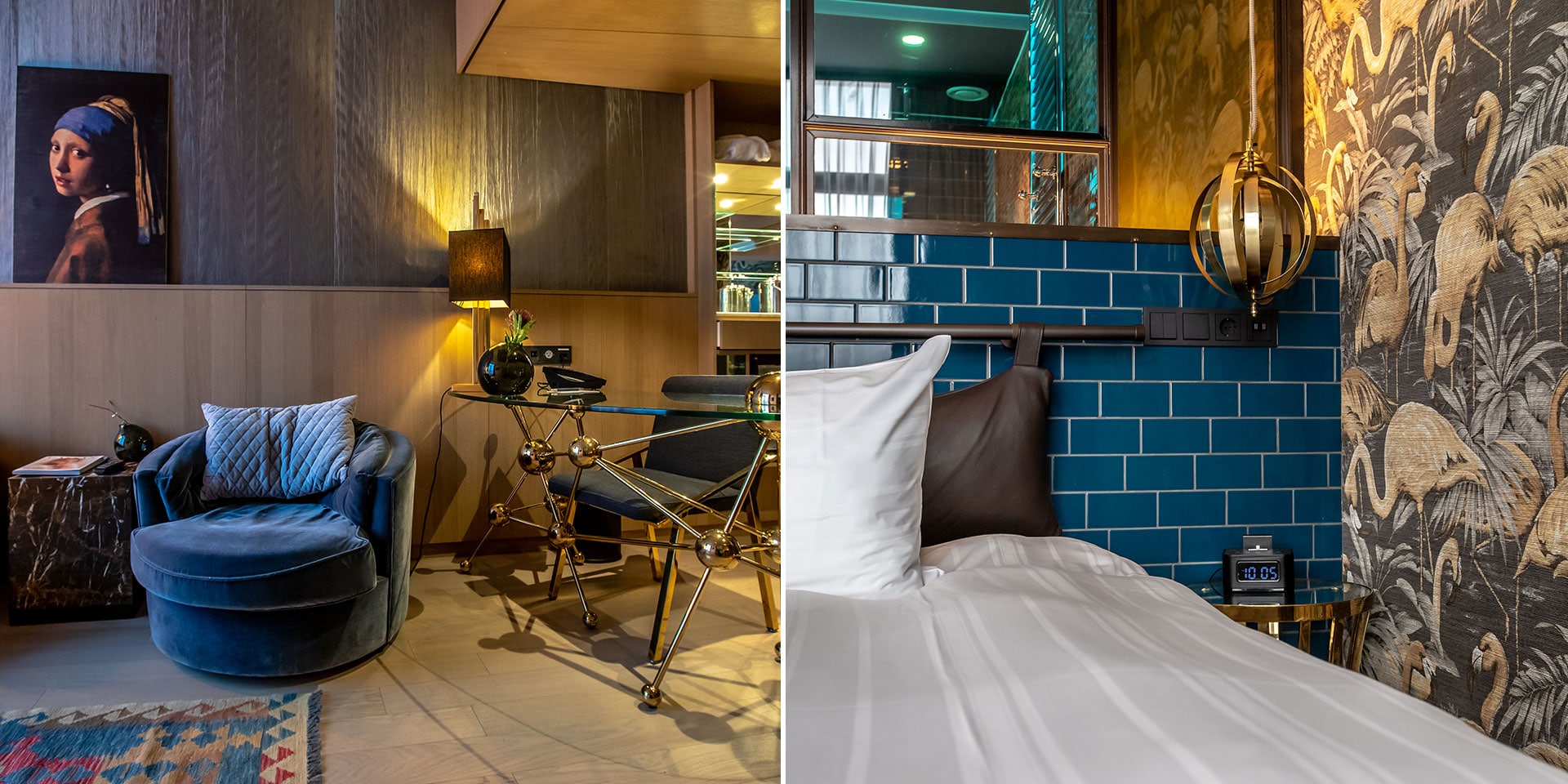
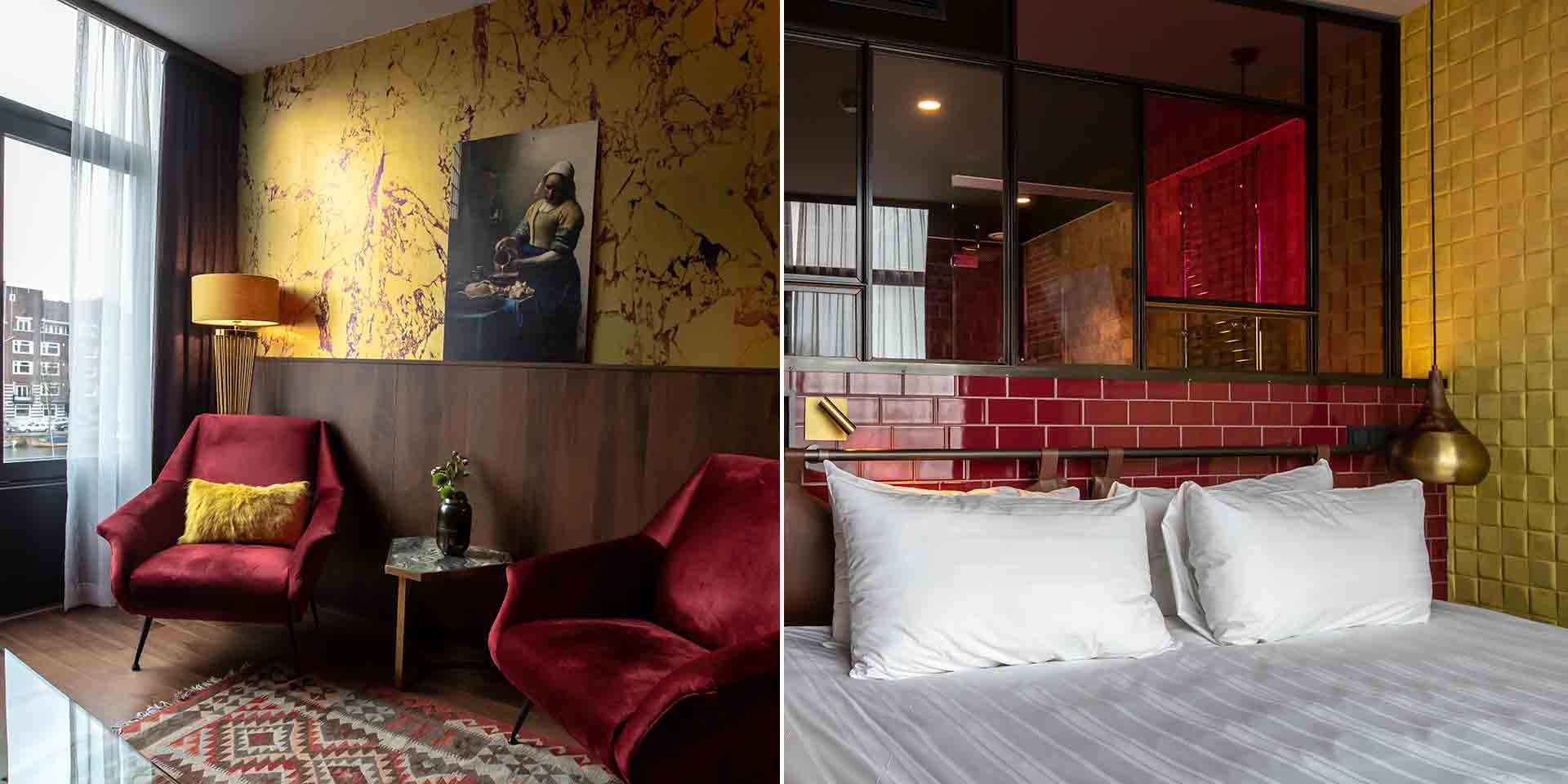
Of the hotel’s 223 rooms, Erens created 33 design rooms and 16 design suites. Like a boutique hotel, each room is different and unique. One features flamingo-print wallpaper and blue tiles while another boasts rectangular blue shapes on the walls and ceiling. A third is covered in a tree pattern.
The carpets or wooden floors, nightstands, chairs, lamps and bathrooms are all different, too. Some have colored glass bathroom walls and replicas of famous Dutch masterpieces, such as Vermeer’s “The Milkmaid.”
Though some might have questioned whether so many disparate elements could fit together seamlessly, Erens maintained his vision. “’Just wait,’ I told them. ‘It’ll all come together in the end.’”
This was the first hotel interior Erens designed, and it won’t be the last. “It wasn’t easy to create something new in a city like Amsterdam,” he says, “but when others start copying you, you know you’ve done something right.”
In the end, he hopes that guests are so impressed by the new interior, they never want to leave.
